Some homes are designed to soothe.
This one was designed to sing.
From our very first conversation, it was clear my clients weren’t interested in playing it too safe. They wanted color. They wanted pattern. They wanted their home to feel alive — layered, expressive, and unapologetically personal. Birds of a Feather became our opportunity to celebrate that bold spirit while ensuring every choice felt intentional and refined.
The result is a home that doesn’t whisper elegance — it speaks it fluently, in full color.
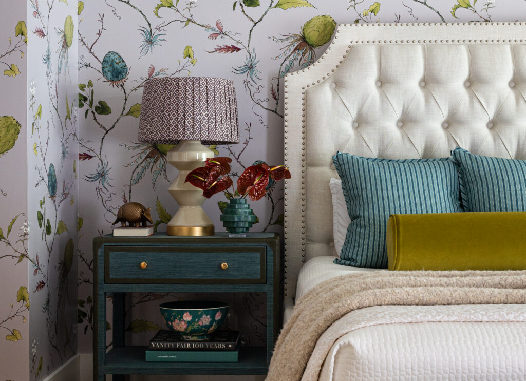
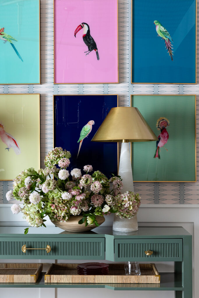
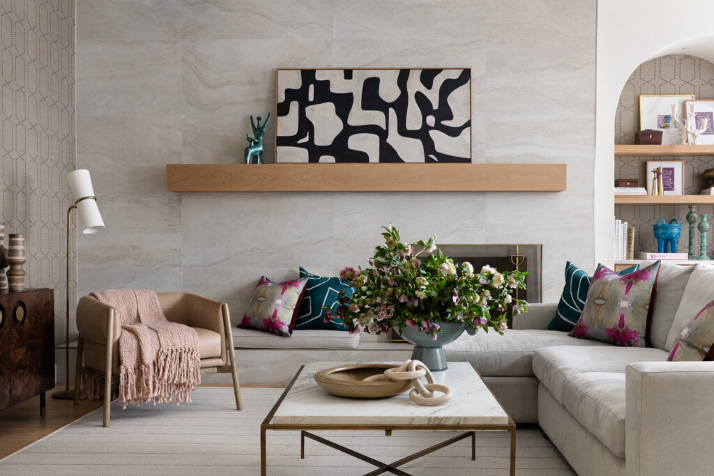
The Power of Jewel Tones
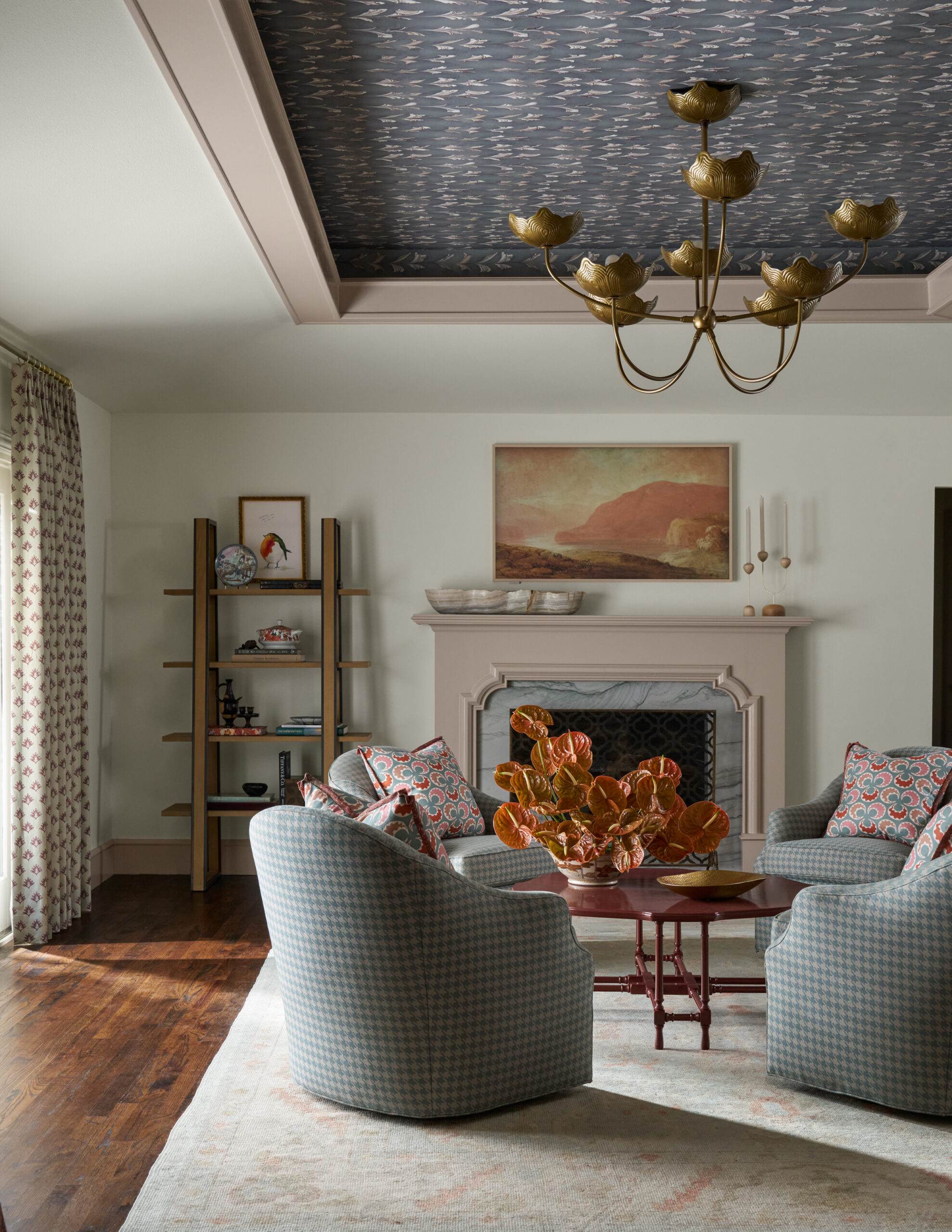
Color drives this project. Not as an accent — but as a foundation.
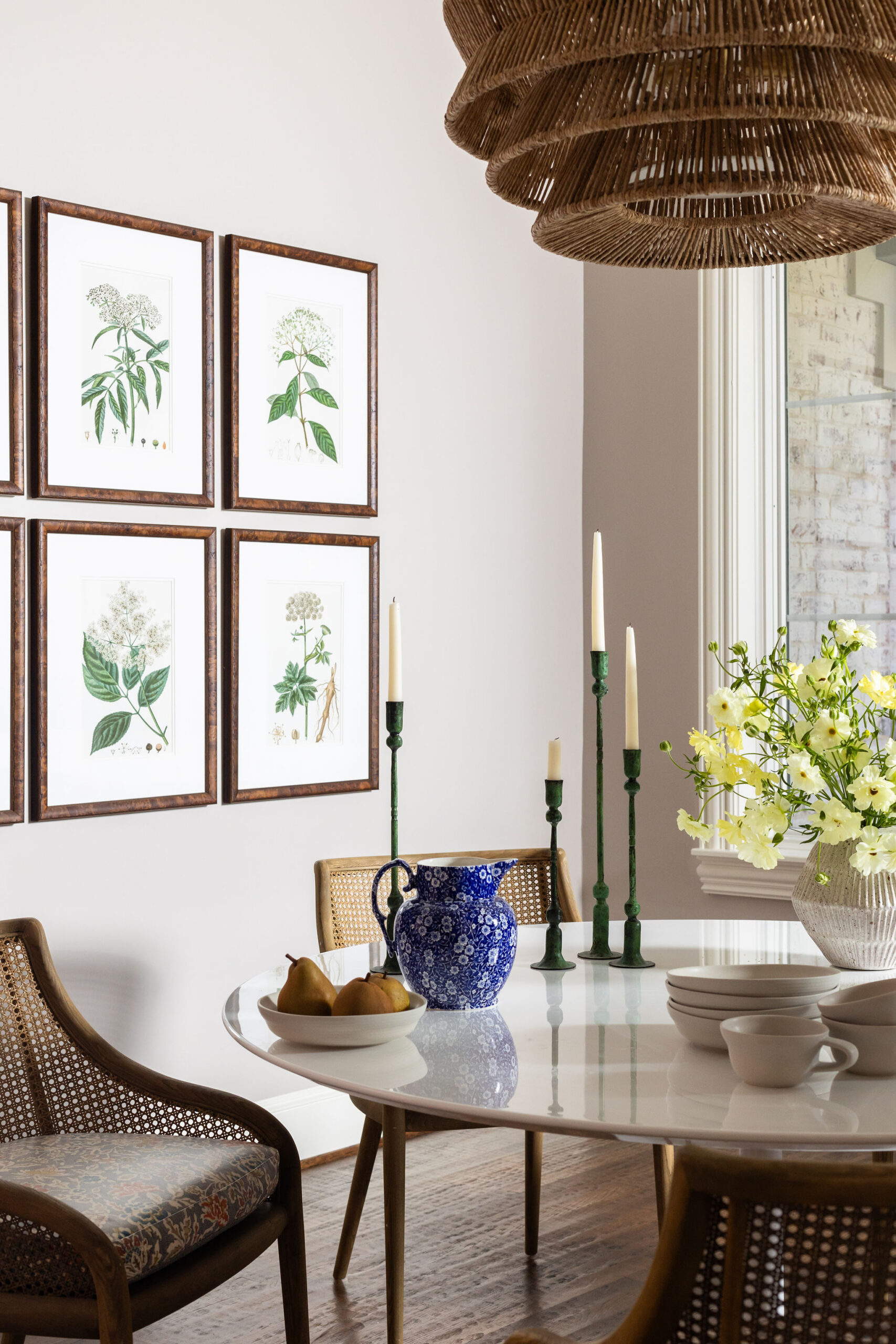
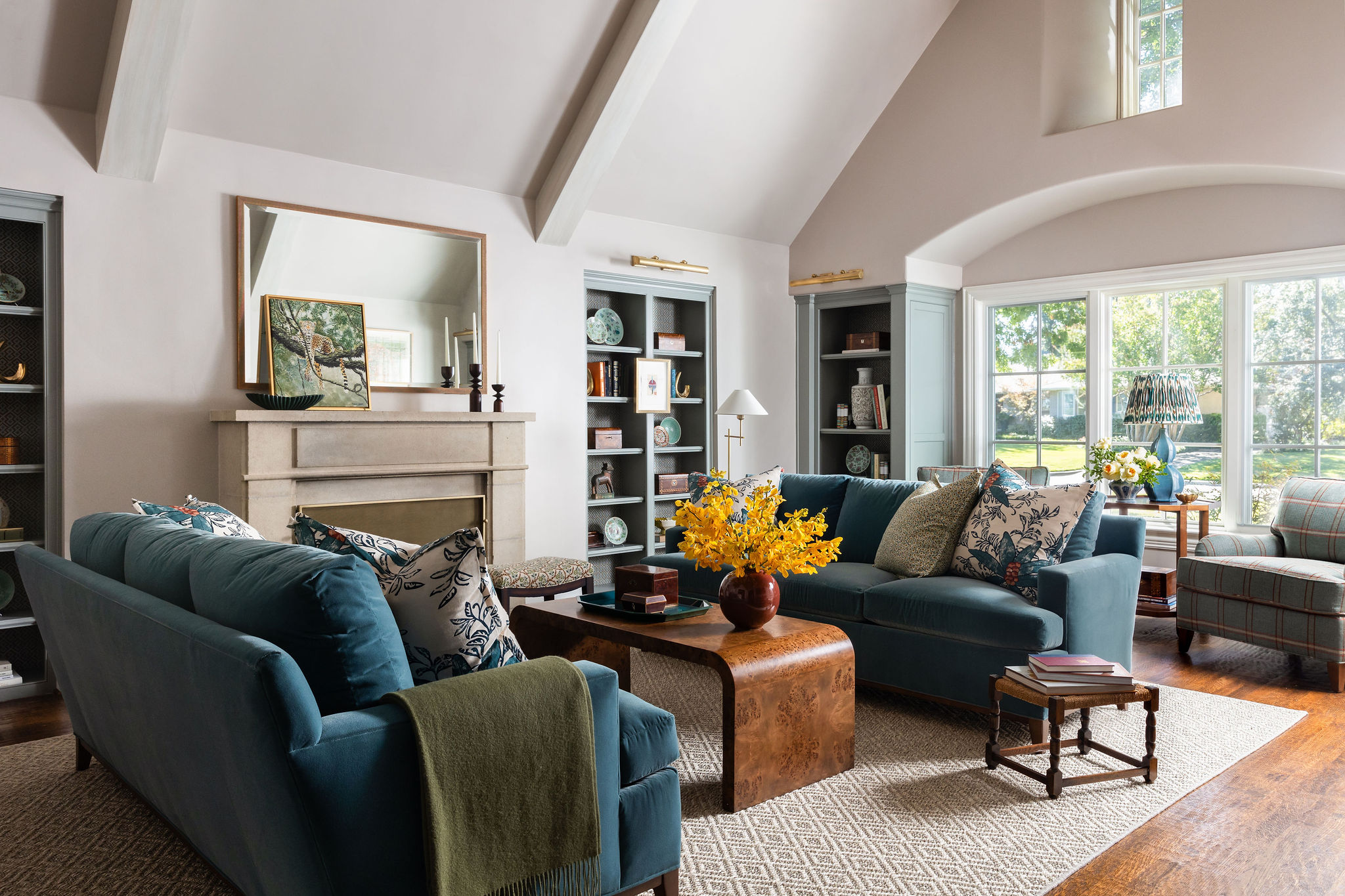
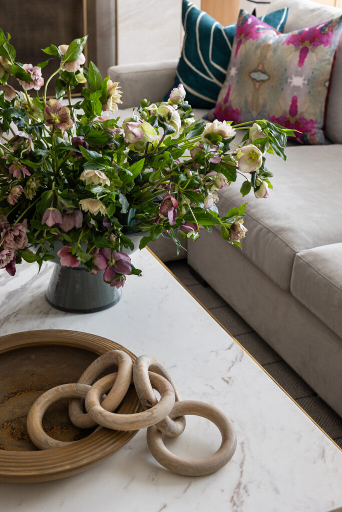
We leaned into fresh jewel tones — saturated emeralds, rich blues, and grounded berry hues — using them as architectural elements rather than decorative afterthoughts. When color is applied with confidence and restraint, it becomes timeless rather than trendy.
Each room carries its own personality, yet there’s a through-line of cohesion that keeps the home feeling curated rather than chaotic. The palette moves, but it never competes. It flows, but it never fades.
This is the difference between using color and designing with it.
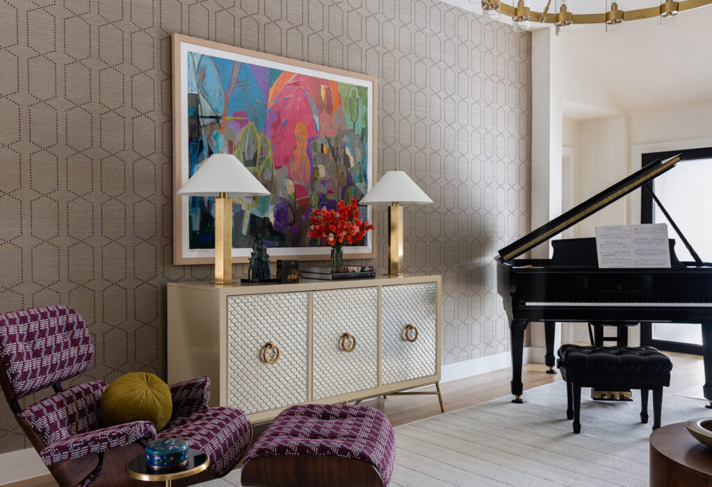
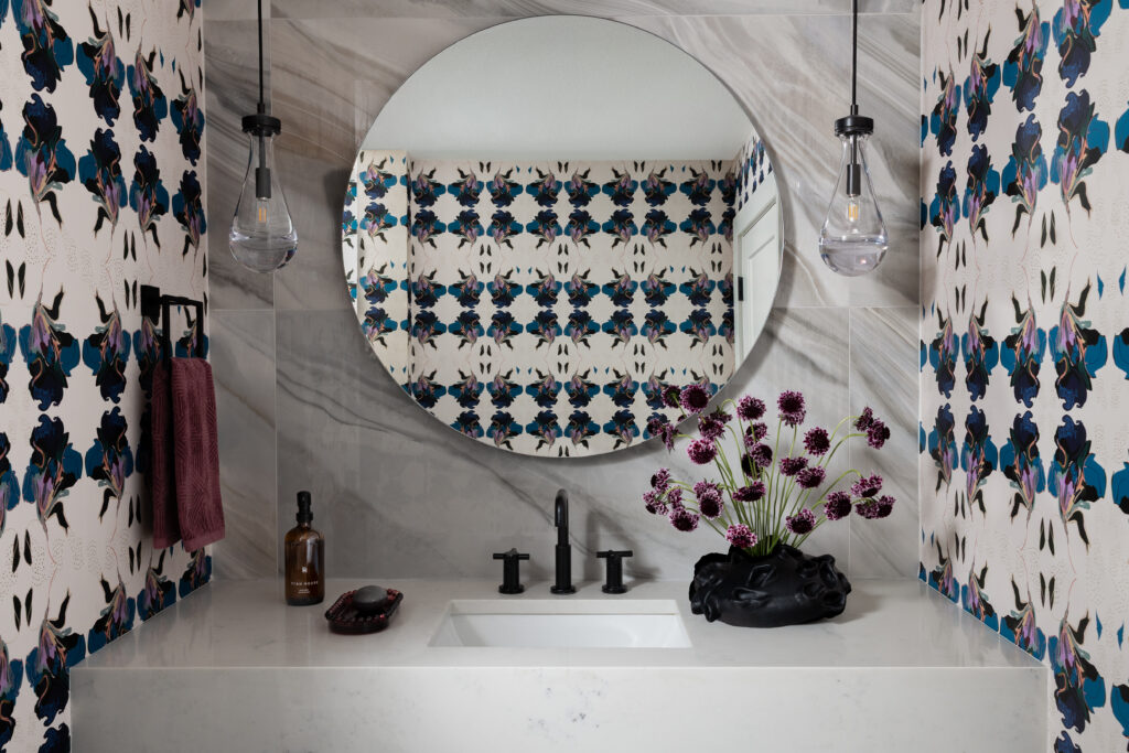
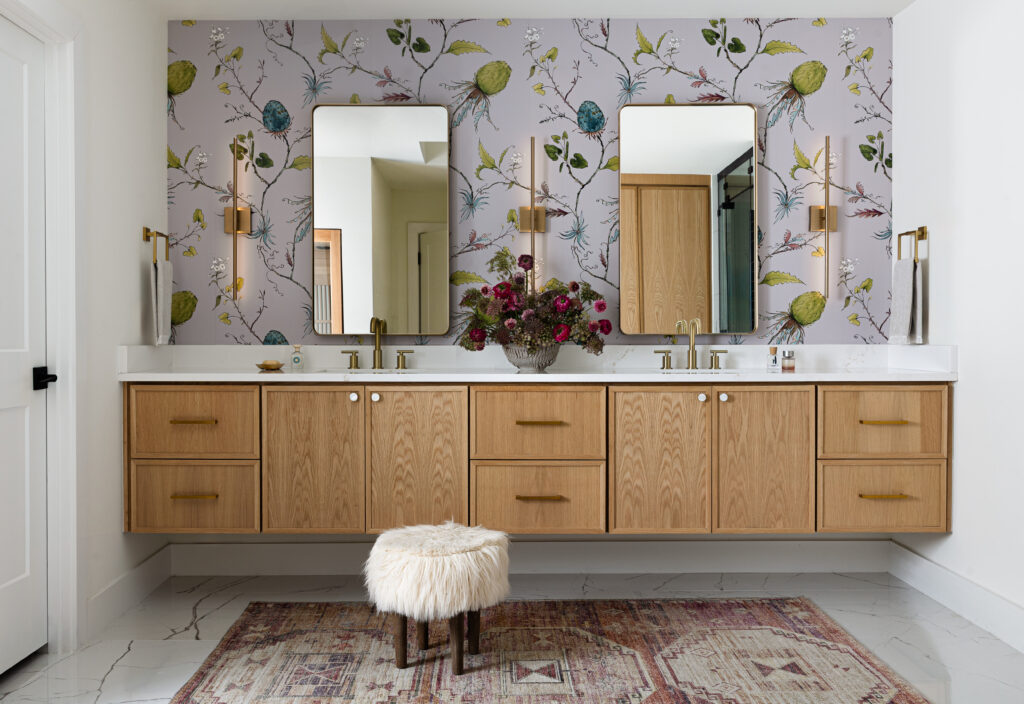
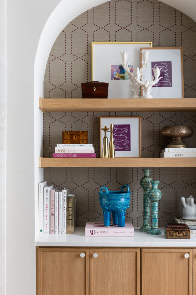
Wallpaper as Art
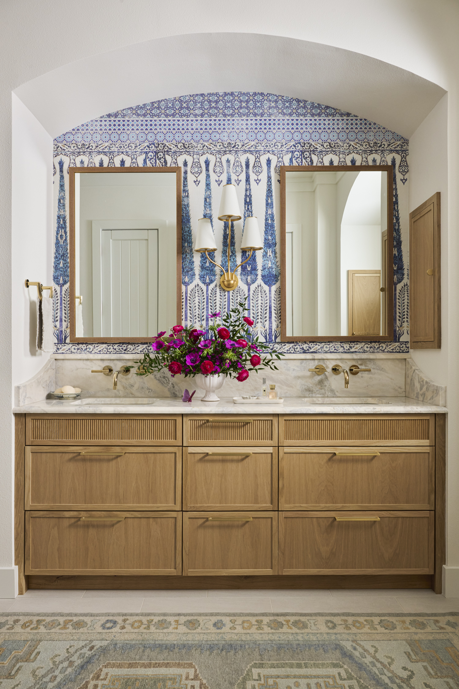
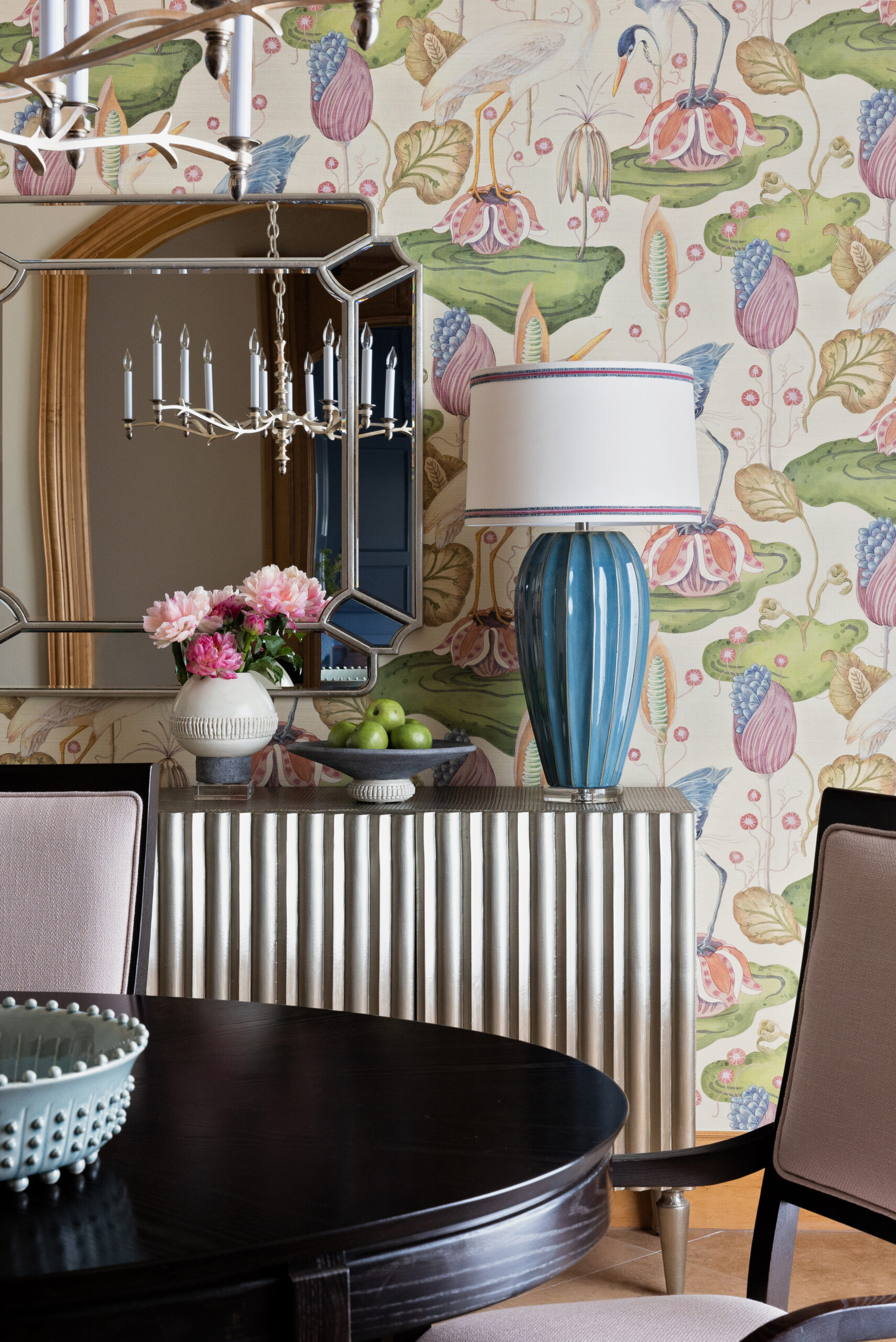
Wallpaper played a starring role in this home.
Rather than treating pattern as background, we allowed it to lead. Graphic prints and painterly motifs introduce movement and depth, creating moments that feel immersive and intentional. In several spaces, the wallpaper became the conversation — anchoring the room and setting the tone before a single piece of furniture was placed.
When pattern is layered thoughtfully, it elevates a space from pretty to powerful.
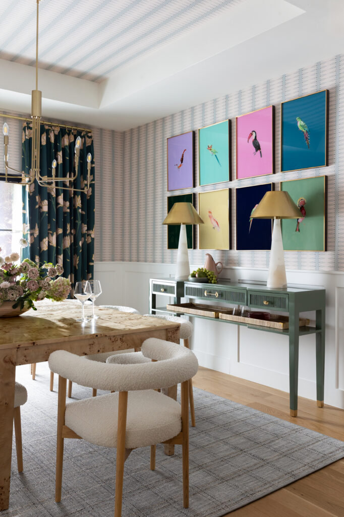
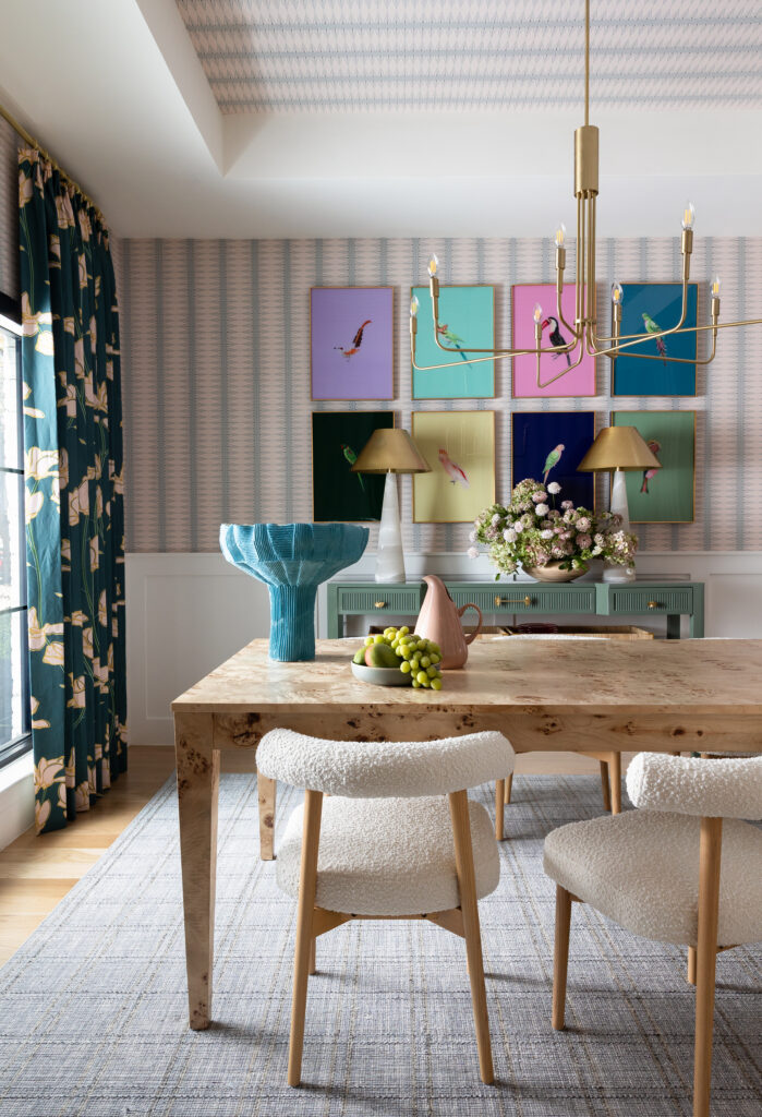
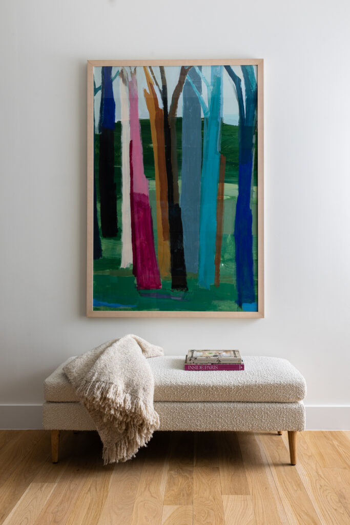
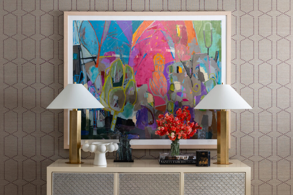
Bold Art, Balanced Interiors
Art selection was critical. With a home this expressive, the artwork needed to hold its own.
We curated pieces that felt dynamic and modern, reinforcing the palette while adding dimension and contrast. Scale was everything. So was restraint. Even bold homes need breathing room — and the negative space between statements is what allows them to shine.
The goal was never excess. It was harmony through confidence.
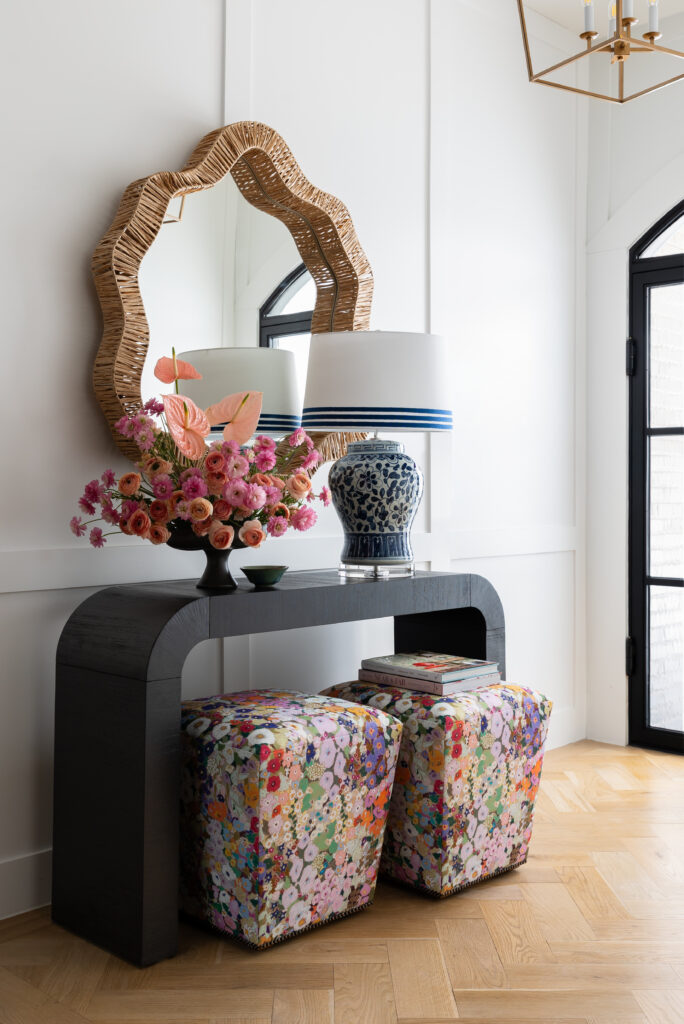
Layered, Not Loud
With so many vibrant elements at play, balance became the quiet hero of this project.
Tailored upholstery silhouettes and intentional negative space ground the jewel-toned palette. Texture adds depth — velvet, woven textiles, lacquered finishes — but always in service of cohesion.
Luxury, to me, is never about volume. It’s about clarity. It’s about knowing when to push forward and when to pull back.
Designed for the Way They Live
At the end of the day, Birds of a Feather isn’t just about color or wallpaper or statement art.
It’s about creating a home that feels unmistakably like the people who live in it.
Confident. Warm. Collected. A little unexpected.
When design reflects personality this clearly, the result isn’t just beautiful — it’s magnetic. And that’s exactly what this home was meant to be.